
Follow Me On Social Media!
Color Harmony Palettes | Curated Whole House Paint Palettes for Timeless & Trendy Homes
Color Harmony Palettes for Timeless & Trendy Homes
Introduction
Imagine stepping into your home and feeling an instant sense of tranquility wash over you. The walls, affectionately wrapped in colors that express your individuality while offering an inviting embrace, become a backdrop to your life’s treasured moments. A well-curated color palette not only enhances the aesthetic appeal of each room but also sets the tone for your entire living space.
In this article, we’ll explore how to create a cohesive whole-house paint palette that harmonizes elegance with modern livability. By understanding color theory and selecting complementary shades, your home can radiate warmth, style, and serenity. Let’s dive into the art of color harmony and discover how you can transform your living environment.
Décor Breakdown
Style & Mood
The foundation of every inspiring home is its style and mood. Do you lean towards a chic modern aesthetic or the cozy comfort of farmhouse decor? A relaxed yet polished style encourages an open, inviting space filled with personality. Consider airy, light hues for larger areas to promote openness, while deeper, richer tones in smaller rooms can create a sense of intimacy.
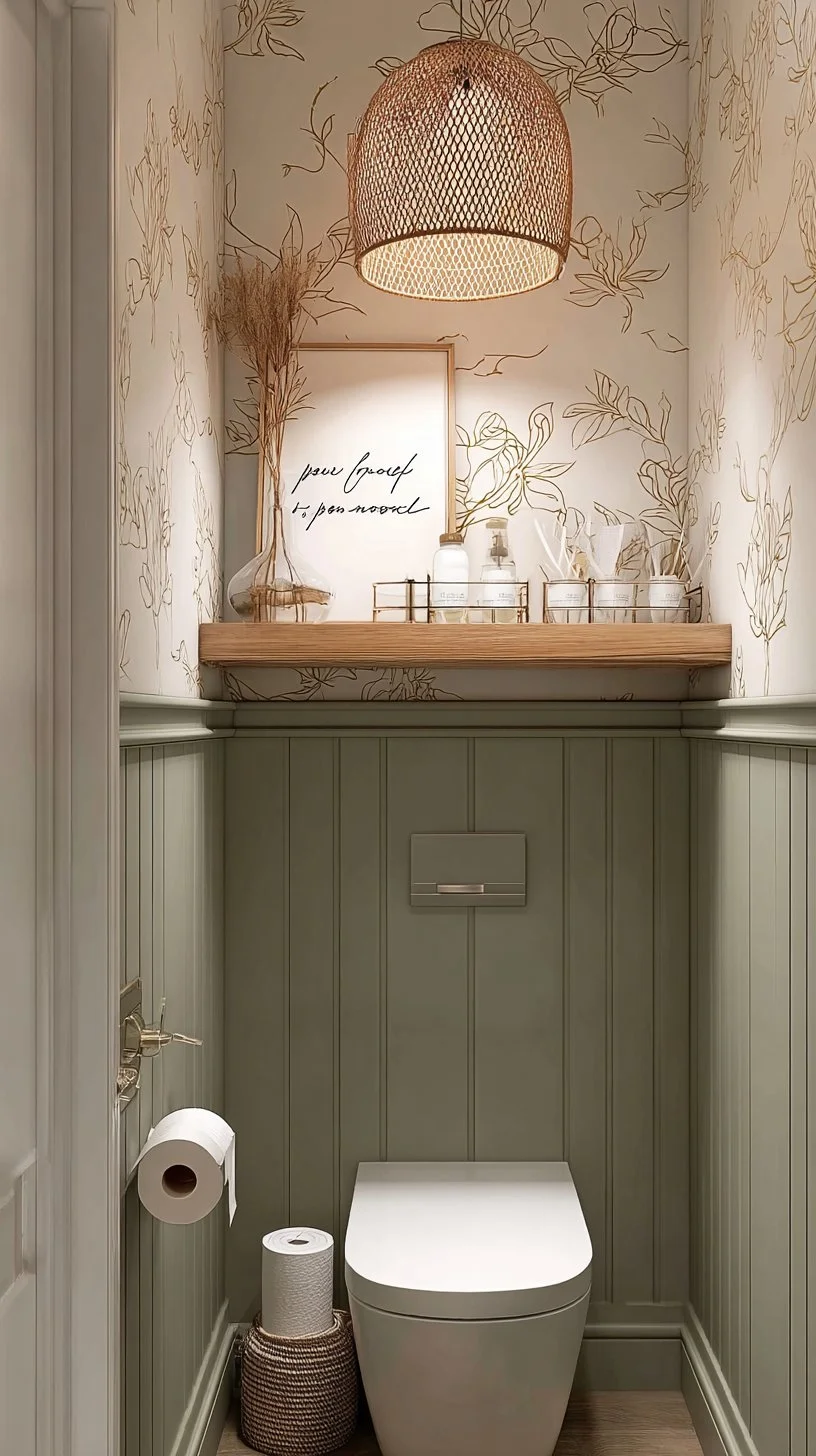
This palette has been fashioned to convey a fresh modern feel while ensuring each corner of the house feels grounded and cohesive. By anchoring vibrant colors with neutral shades, you create balance that acts like a warm hug.
Color Palette
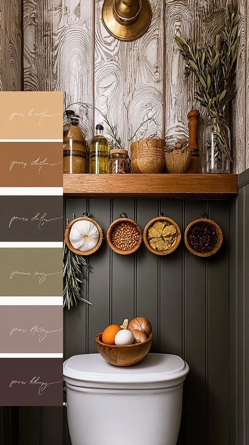
Let’s settle on a stunning and harmonious color palette that speaks to your heart. A combination of soft beige as your base, complemented by muted greens and rich navy accents can strike the perfect balance between tranquility and confidence. Here are some suggested colors:
- Soft Beige (Main Color): A calm background that brings warmth and light.
- Sage Green (Accent Color): This earthy tone introduces a breath of fresh air, reminiscent of nature.
- Navy Blue (Pop Color): A bold choice, navy adds depth and sophistication, perfect for a feature wall or furniture.
- Creamy White (Trim and Ceiling): To open up spaces and create a crisp, clean contrast with the warmer tones.
Key Furniture & Décor Elements
Choosing furniture and décor elements that resonate with your color palette is vital. Natural wood furniture, characterized by warm tones, pairs beautifully with the soft beige and sage green. Opt for sleek lines and minimalistic designs that let the color do the talking.
Accentuate your space with throw pillows in navy and warm textiles, such as wool or cotton, that add layers yet feel comfortable. Artwork can also play a significant role; consider adding pieces in complementary tones that tie the palette together.
Lighting & Textures
Lighting is an essential element in achieving harmony within your home. Implement a mix of ambient, task, and accent lighting to create varied atmospheres in different spaces. For example, pendant lights in warm metals can beautifully reflect the hues of your walls while inspiring a chic modern touch.
Texture comes into play through various materials—think plush rugs or wooden coffee tables that invite tactile interaction. Create contrast through diverse elements such as smooth ceramic vases against soft fabrics, adding depth without overwhelming the visual senses.
5–7 Practical Home Décor Tips
- Experiment with Sample Paint: Always test paint on your walls and observe how it changes throughout the day with different lighting.
- Use Color Block Techniques: Consider painting a single accent wall for a dramatic effect without overcommitting to a loud color.
- Layer Your Textures: Incorporate a variety of materials in cushions, throws, and rugs for a inviting ambiance.
- Keep Accessories Minimal: Choose a few standout pieces that can make a statement without cluttering the space.
- Incorporate Greenery: Plants not only introduce a pop of color but also enhance the air quality.
- Stay Consistent with Finishes: Choose hardware and decorations in similar finishes to maintain a coherent look.
- Create a Focal Point: Whether it’s a piece of art or a well-furnished coffee table, ensure there is a point that draws the eye.
Budget-Friendly Alternatives
Creating your dream space doesn’t require a hefty budget. Opt for DIY projects such as repainting old furniture or upcycling thrift store finds. You can also explore peel-and-stick wallpaper for an affordable way to infuse patterns into your home.
Additionally, consider shopping at discount home goods stores for decorative items that align with your chosen palette. These pieces can offer the same aesthetic appeal at a fraction of the cost.
How to Recreate This Look at Home
To recreate this cozy yet modern living space, begin with your chosen color palette. Select paint that matches your vision and choose furniture that complements those hues. Shop for accent pieces that echo your style, and consider your lighting carefully. Don’t forget to incorporate personal touches that resonate with your experiences—whether it’s family photos or travel souvenirs—to ensure the space feels uniquely yours.
Conclusion
By embracing the principles of color harmony, you transform your home into a sanctuary that reflects your unique personality and style. A well-executed color palette does not just enhance your environment; it has the power to uplift your spirit every single day. So why wait? Start your home transformation journey today and create a space that’s as timeless as it is trendy.
In the atmosphere of warmth and comfort, life’s best memories await.